
When it comes to website design trends, it is important to remember they are what many consumers around the world are seeing and using in order to interact with brands, people and get things done. That being said the latest trends are simply breathtaking and imaginative since each one fills a different set of needs for publishers and visitors alike. Some of the most popular ones are here to stay, 5 of the most interesting will be analyzed next:
1. Split Screens
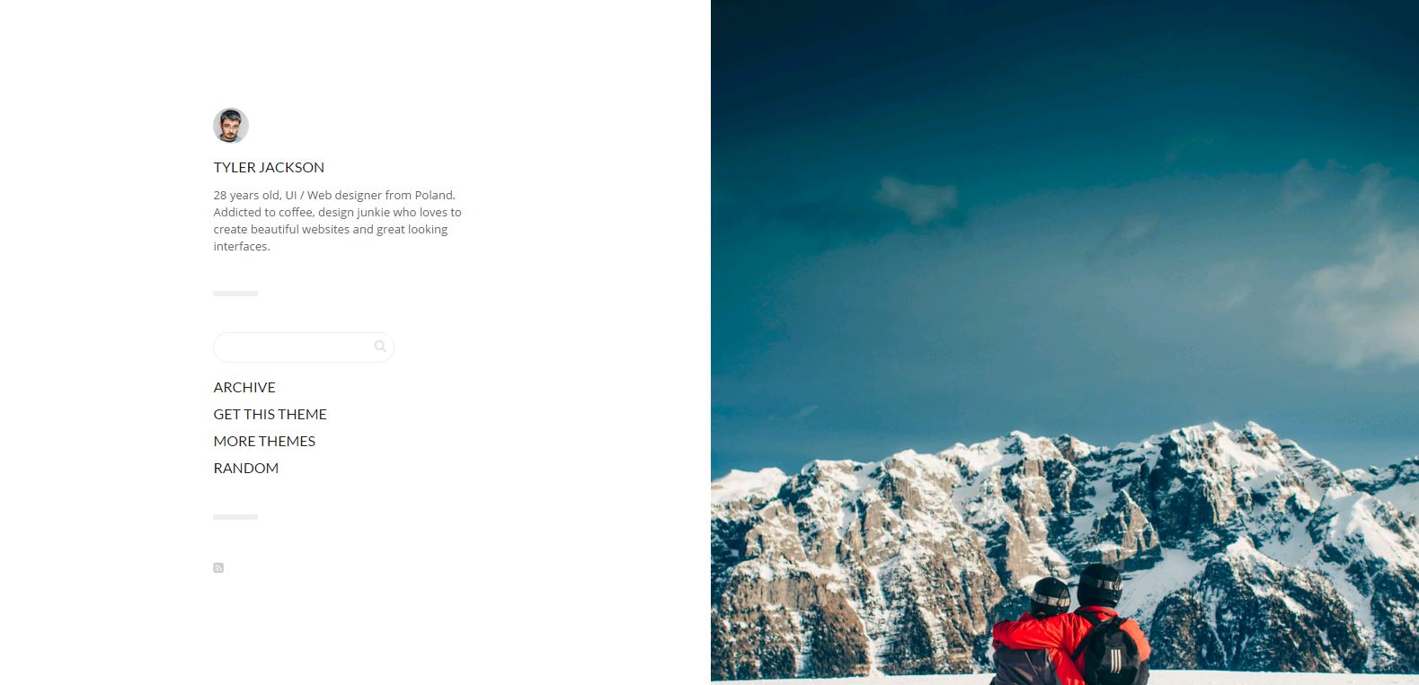
The split screens layout is known as split layout where a webpage is divided into many symmetric parts, more often than not they are divided into two halves in order to display different areas of content. They usually follow a contrast color scheme. The effect is very artistic while at the same time it limits the amount of information the user sees with a focus on the target. Relatively large or full screen images are usually included into this type of design.
2. Block grids
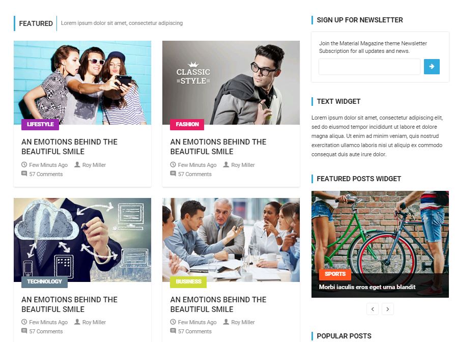
The grid is a really useful design tool. Over the last years, it has become indispensable and ubiquitous in web design frameworks. Its evolution has been unique since now its parts are being divided into modular components. An example of this is how the concept of cards has been stacked to show information in mobile devices. Most pin sites leverage this trend.
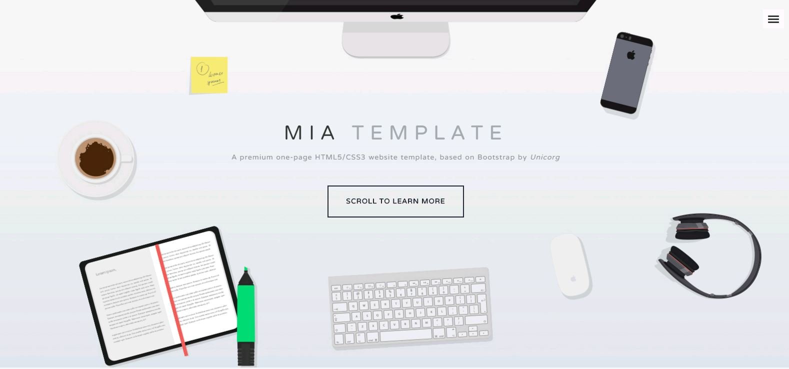
3. Single screen layout
Some branding sites tend to use a design where everything can be seen in a single screen, without the need for scrolling. Although this is how information is usually presented in traditional media, it means that a visitor interacts only with what they currently see. This leads to a thoughtful presentation of information from the publisher and a more calming, minimalist experience for the user.
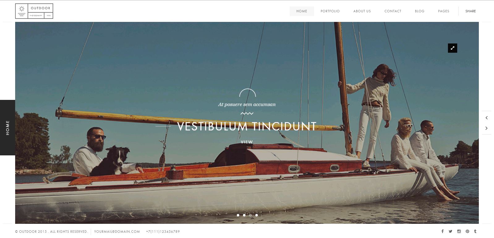
4. Big backgrounds / Parallax
Some effects require many resources in order to be presented; this is not the case with the parallax effects since HTML5/CSS3 technologies make it really lightweight to do so. The result is a nice animation that uses few resources. Big backgrounds are all the rage in minimalist designs since they can save at least a thousand words when used wisely. The mixture of both trends allows for a modern, minimalist experience.
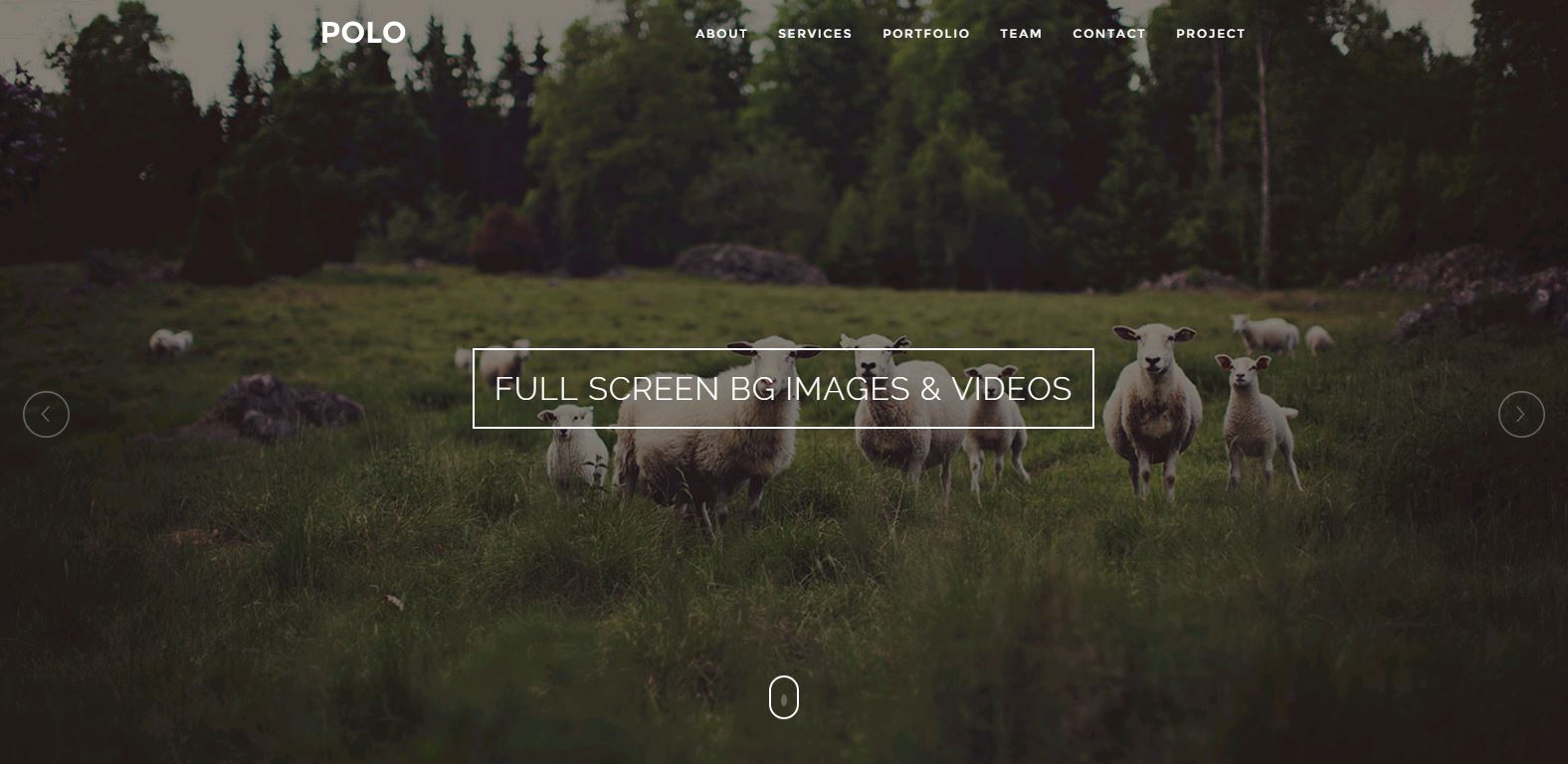
5. No chrome
What could be considered by many as a step back in design, no chrome design paves the way for simplified yet powerful interactions. By eliminating the header and footer, trendy navigation schemes remind the user of the early days of the modern web, where experimentation provided not only information, but excitement and thrill. When this trend is mixed with the ones mentioned above, there is no reason not to experience art while fulfilling the purpose of visiting a website.
The aforementioned trends are likely to fusion into the web design trends for 2016 and for many good reasons. With visitors getting used to standard and proven UX experiences, a few variations and pollination between trends can be reasonably expected. What used to be considered as a technical art form is taking a more user-centric approach to deliver, categorize and present information of every kind. With the ubiquity of the web and a focus on visually appealing usability, Split screens, Block grids, Single screen layout, Big backgrounds/Parallax, No chrome will take internet users to see more, do more and be more.