
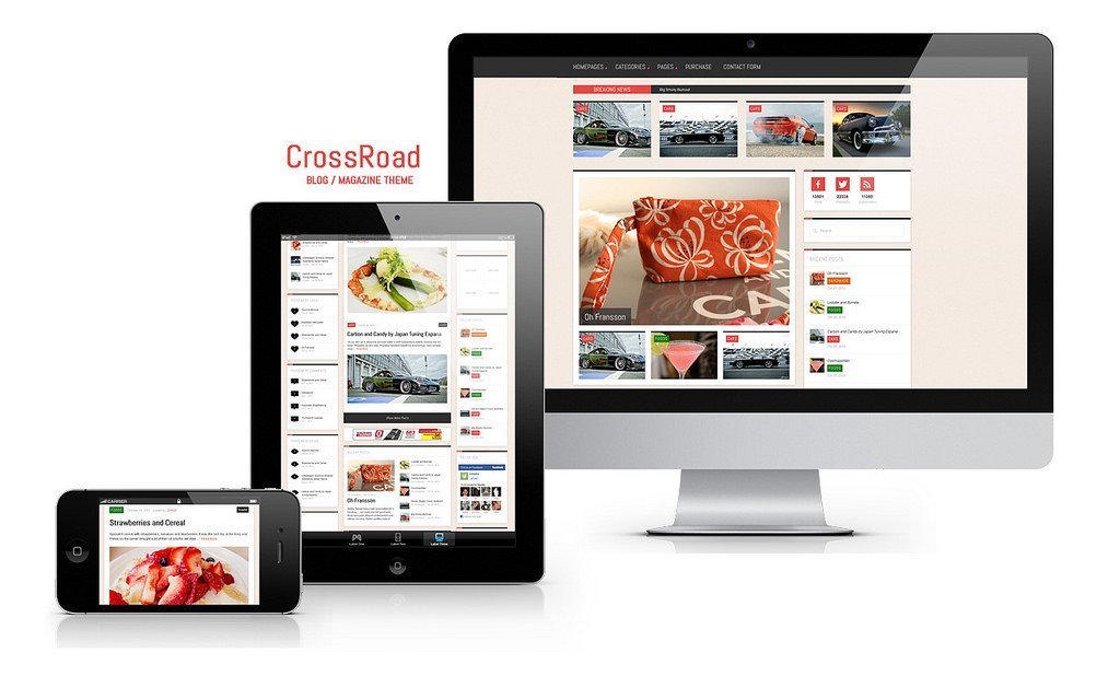
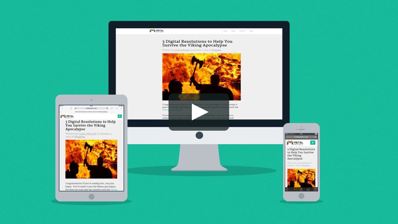
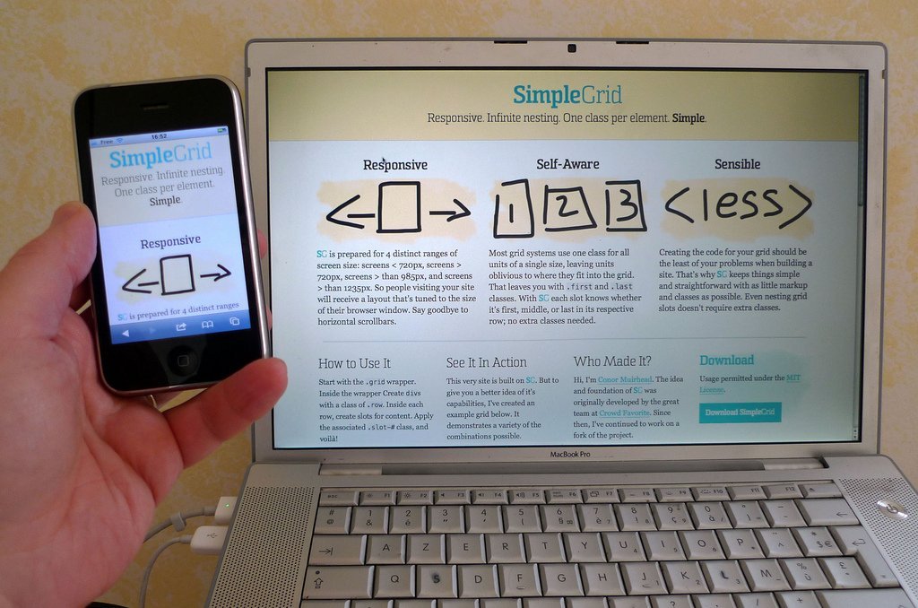
Responsive design is an excellent solution when it comes to different screen sizes. It’s a represents a set of techniques and practices used to build websites which work well on desktop computers, tablets, and mobile devices. Until recently, almost all websites were designed generally for desktop and laptop screens, which worked out nicely until tablets and smartphones started taking over the market. Now a half of all internet traffic comes from a mobile device, making responsive web design more of a necessity than it is a choice.
Compared to desktop-first design, which focuses on designing a website which is generally optimized for desktop computers, responsive design provides the users with a website which isn’t restricted by millimeters and inches, fixed page sizes or any physical constraints. Instead, the layout if fluid, which means that it adapts to the screen size it’s being viewed on. For now, we’ll cover some of the basic responsive design principles, but the focus will be on layouts, for the sake of simplicity.
Difference between adaptive and responsive design
Although the adaptive and responsive design may sound similar to those who are unfamiliar with the concepts, they couldn’t be more different. Unlike responsive web design which focuses on a single layout which is constantly changing depending on the screen size, the adaptive design uses a number of distinct layouts each tailored for a specific screen size. Responsive design, on the other hand, adjusts its layout regardless of the device or the screen size it’s being viewed on and does so fluidly and without any hiccups, where adaptive design sort of snaps into specific screen size.
Responsive web design is not the same as mobile-first design
Although the reasons behind the use of responsive web design are closely related to the upsurge in use of mobile devices to browse the web, responsive design isn’t only about mobile. How you view your content should not be influenced by how you access it and what device you use. This is where responsive design comes into play as it allows for the best user experience across all devices. Mobile-first design actually focuses on designing a mobile copy of the website first and then moving on to the desktop copy.

Content flow and units
The key principle behind responsive design is to have the content flow depending on the device used to view it. When you’re reading an article on a laptop, the text will take up more horizontal space and when you’re reading it on mobile, it shifts to vertical. This may become somewhat tricky for those used to designing using pixels and points, but it’s not that difficult to get used to. This is especially true when it comes to units, as they have to be flexible enough to work with varying pixel densities. Instead of using points and pixels, responsive web design relies on percentages. Experts from Nirmal Web Design Sydney argue that making something 50% wider means that it’ll always take up 50% of screen real-estate, regardless of the actual size of the screen.
Pay close attention to breakpoints!
Breakpoints are essentially rules which describe how and where the content will break in order to provide users with the most efficient layout for information consumption. For starters, the best way to define the breakpoints is to use the width of the device you’re targeting. Generally, these include mobile (320×480 pixels), tablet (768×1024 pixels) and desktop (everything above 1024 pixels). Where will put a breakpoint depends mostly on the type and size of the content, but the best course of action is to place them at the end of a sentence.
System or web fonts?
This is a highly debated topic and people prefer one over the other. Web fonts often come from a CDN or some other runtime source, where system fonts get saved by the system. Although web fonts look absolutely amazing, each web font you use has to be downloaded from the CDN first, and the more web fonts you use, the more it will take for the page to load. Unlike web fonts, system fonts load instantly, as they are already stored on the user’s system. The best web design relies heavily on a good mixture of system and web fonts, so try to choose carefully.
Bitmap or vector images?
Although both have their benefits and drawbacks, they couldn’t be more different. Bitmaps generally come as GIFs, JPEGs, and PNG files and are made using pixels. Each pixel is a small colored square which is arranged in a pattern to make the image. One of the major drawbacks that come from using them is that you can see individual pixel when you zoom into the image. Vectors use SVG format and they rely on a mathematical formula which draws the curves and lines, instead of using pixel patterns. The main difference is that bitmaps are a lot lighter when it comes to file size and as such, load more quickly.

There are just some of the key elements which are used in responsive web design. There’s a lot more information available online, so make sure to go over it before you start working on your website. And whether you’re building it from scratch or you’re trying to convert an existing design into a responsive on, pay close attention to the above-mentioned principles. They will save you a lot of time you would normally waste figuring it out all by yourself.
Author bio: Sam Cyrus is CEO and co-founder of GWM, a Digital Marketing agency from Sydney. Sam is also a creative writer and likes to to shares his insights on entrepreneurship, business, online marketing, SEO and social media.