During our training in web designing, we come across many terms that we do not really understand until we start creating our own designs. There are many such terms that fade from our understanding because we do not devote much time on it considering them rather trivial. Once such aspect of web designing is Negative Space. It sounds as if it is unwanted and must be avoided, but in fact, it is the staple of web design.
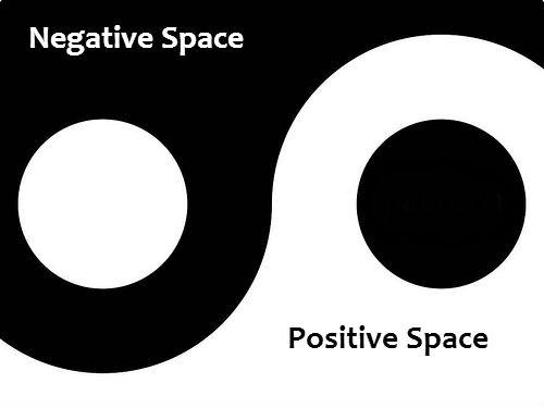
The use of negative space in the creation of brand logos is also quite noted. The logo of FedEX, for instance, has an arrow between E and X that denotes forward growth. In the websites too, the negative space can be used wisely to create meaningful symbols.
Even if you are not making something out of negative space, it should be utilized very carefully. Websites that do not understand the importance of negative space often end up being over-crowded. Such web pages are a big turn-off among the users as they are not able to scan them easily and face difficulty in finding the content they are looking for.
What is actually a negative space?
A web page is comprised of several design elements like texts, images, navigation, etc. The space that these elements occupy on the page is referred to as positive space, and the spaces around and between the positive space is called negative space or sometimes white space. Negative space as it seems, is not an undesirable space. It has a lot of contribution in the beauty of a web page. It, in a way, defines the users’ interaction with the website.
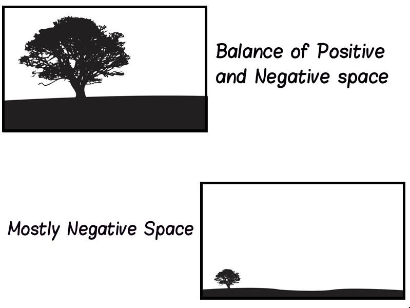
Negative space is also categorized into two types depending on its size and their position.
Micro Negative Space
As the name suggests, the size of the space is less. However, the size must not decide the importance of this space. In fact, the right use of this space between the text blocks makes the website appear organized and more readable. Such web pages are soothing to the eyes of the readers and they are able to find what they are looking for quite easily.
Essentially, the micro negative space is between the paragraphs, lines, letters and so on. It is needed to be ensured that the space between these elements is tight and not over or underdone. It should neither be crowded nor very relaxed. Maintaining the right balance is the key to the perfect design. The height between the lines within a paragraph also needs to be given special attention.

This task is not as easy as it seems to be. Deciding on the correct space requires a lot of deliberations and real time verification. The designers need to check the appearance of the website with different schemes of spacing and choose the one that looks the best. If you are looking the websites that showcase the best micro negative spacing scheme, then you can go through digest.com, FedEx, Tuts+, and several others.
Some Tips To Best Utilize The Micro Negative Space
- Use a readable typography that also suits the theme of your website.
- Achieve balance and consistency by measuring the content area.
- Look for discrepancy in the design element by keenly observing the micro negative space.
- Use micro negative space to accentuate or diminish the visibility of a particular website section.

Macro negative space
The whitespace around the header and footer is known as the macro negative space. As this space is larger than the space between the letters and lines, it is called macro space. These spaces get the most attention of the users and hence, the spacing should be smart and strategic. Overcrowding of these spaces may distract the users and leave a bad impact on them.
If we talk about the header, it is the first section of the website that users cast their eyes upon. This is the reason why the designers stuff this section with more and more information without thinking of its repercussion. Instead of filling this section with clutter, efforts should be focused towards including the most important content in the header so that the users do not feel burdened with information in one go.
Things are little different around the footer. This section is not under a strict scanner and you can be a little lenient while adding content here, but the golden rule says that this area too, must not be crowded with content. Hence, in order not suffocating the users with information they do not desire, unnecessary content must be trimmed from spaces around the footer. Also, there should be plenty of space around the call to action button.
What makes them so important?
Success of a website largely depends on its level of usability and negative space is directly associated with it. Users need to read the content of the website comfortably and find what they are looking for, without scanning too much. Presence of negative space makes a web page free of clutter that distracts the users. It must not be seen as a waste of space, but the optimum use of it.
If we draw an analogy of a web page with a house, the importance of negative space can be clearly understood. A house that has most of the space occupied by some items will remain with very less space to walk. Moreover, if you start to look for a particular thing, you will be bewildered owing to the items kept all over the house. The aesthetic value of the house will also be seriously impacted. On the other hand, when a house has fewer things kept at strategic positions, staying there becomes a breeze. Same holds true for the web design.
The key to manage the negative space lies in the selective choice of content that should be posted on the web page. Keep only that content which defines the user experience of the website and boosts the usability. Rest of the content should remain hidden in drop down menu and other places. The web designers’ effort should be laid on making things easier for the users and not overwhelm them with a bunch of confusing options.

Final Thoughts
It is now quite evident that the negative space is an integral part of web design and must be taken very seriously. Optimized use of both micro and macro negative space enhances the look and feel of the website and also the readability of the website. It ultimately culminates into a better user experience, thus enhancing user engagement and retention.
Author’s Bio
The blog has been authored by Nola Arney, a web developer employed with HTMLPanda- PSD to HTML5 Conversion Service Provider. She is inclined towards writing informative articles and blogs about web technologies to share important concepts related to the development and designing of the web app, mobile application, and responsive website. All her posts are the best source of inspiration for many application developers from all around the world.
