
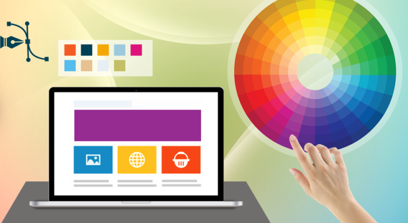
When working on the design of a new site, a question that continually arises is – “How should I choose the right colors for my website?” Colors are the identity of your brand, and they communicate far more than you realize. In web development & designing, picking the right color palette for a website is necessary to brand your product or service while conveying your message in the most effective way. Everyone has some preferred colors, but how those colors are rendered vary from culture to culture and users to users as well.
Colors have a strong impact on visitor’s mood, emotions, and attitudes. Choosing wrong colors can be a disaster for your site. In this highly-competitive online market, it is essential that the color scheme of your site is planned and optimized for conversion.
Let’s have a look at the basic Color Psychology that will help you come up with the stunning web designs:
Color and the Conversion Funnel
Before you go deep into the web design theory, it’s necessary to understand “Color and the Conversion Funnel” and its main elements. A conversion funnel enables you to understand the flow of your potential customers after they come to your site and take the desired move. Basically, the conversion funnel consists of four main elements:
• Awareness
Awareness is all about attracting potential audience or customers to your website. It is the main part of the conversion funnel where they get introduced to your products, services, & brand. They get a chance to be familiar with your market, culture, and your mission statement. This is where colors start playing an important role. By knowing your target audience and the sentiments you want to evoke, it is easy to plan the overall color scheme.
• Interest
In this step, you are working to stimulate the engagement of your site visitors. You need to instruct them to discover further and go deeper into your website. Your primary focus should be on improving headlines, banners, images, and writing a compelling content.
• Desire
When you have understood the interest of your target audience, you need to make them get your product or services. The images, products, videos, and review of your site should provide all the essential information that they need to take the desired action.
• Conversion
This is where your visitors convert into the customers. So, you need to pull their attention to the call-to-action button. Here, you should choose a shade that compliments your overall color scheme but appealing enough to draw the visitor eye to the call-to-action.
The Vocabulary of Color
The color theory consists the whole psychology of colors, but for web design, it means combinations of colors in such a way that attract visitors towards the product or services available on the website. It can be well accomplished through the right use of color schemes, vibrancy, and contrast on your web page.
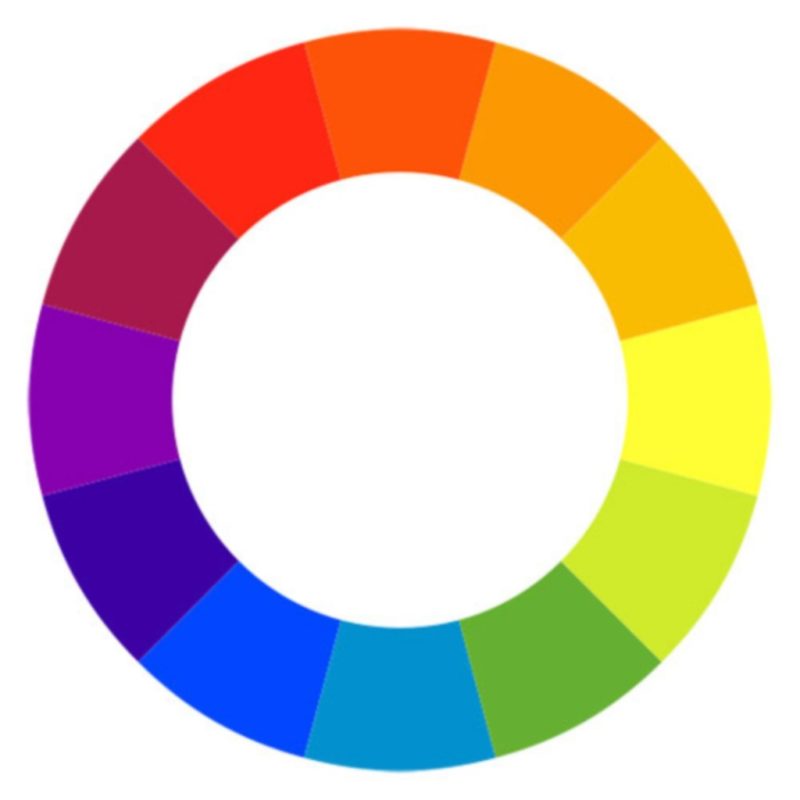
• Color Wheel
Color theory was originated from the “Color Wheel,” which is used to merge the colors in order to get more harmonious tones. By adding two or more colors in this wheel, it is easy to create ‘color chords’ and ‘color harmonies’ that are very attractive to users’ eyes. You can even create your own basic color scheme for giving great impact on the visitors.
• Primary colors
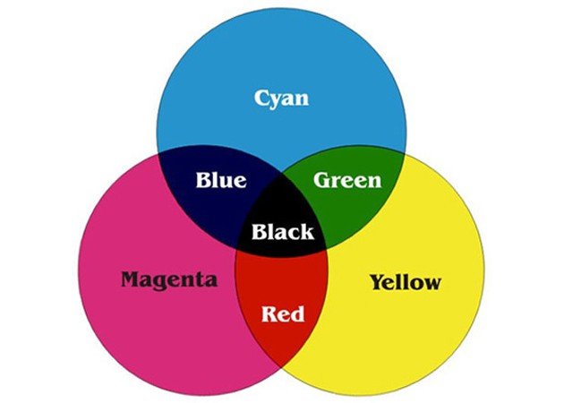
Generally, we consider red, yellow, and blue as the primary colors, but a study reveals that cyan, magenta, and yellow play a vital role when it comes to web designing. These three colors are used to produce different colors and create the base for all other tones and shades. Every color is the combination of these three colors in differing amounts tints, brightness, and shades.
• RGB & hex
Red, green, and blue; all these three colors define other colors as a combination of three different values such as a specific shade of red, another of blue, another of green. Some of the RGB variations are listed below:
• RGB (0, 0, 0) is black
• RGB (255, 255, 255) is white
• RGB (59, 89, 145) is blue (Facebook blue)
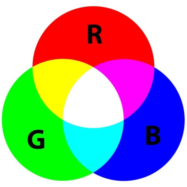
With the right selection of values & shades, you can create the most impressive website.
Color psychology
Every color and shades have its unique aspects and meanings. By carefully choosing the right colors, you can convey the overall message of your website. Color usage can vary over different cultures and regions. The below-mentioned information is followed by most web designers:
• Red
Red is known as the most vibrant & aggressive color that reinforce several meanings depends on the context. A combination of black & red gives strong feel ideal for the sports car. Another combination of whites and golds describes love and passion. Moreover, red defines danger and stop signs.
• Yellow
Yellow symbolizes the sun, warmness, and summertime. It is also known as the most visible color, so it has a capability to change the overall appearance of your website. When it is combined with white or black, it makes the web page more eye-catching. Be careful while using in on your website as some people do not like yellow.
• Orange
Orange is also a warm color, but it is less aggressive than red. It is widely used to design the websites that provide construction, safety, and hunting equipment. Orange color evokes fun as well as energetic atmosphere.
• Blue
Blue recalls the divine, the tropical, and the professional appearance. Providing its long relationship with water, we consider blue as fresh and refreshing. However, darker shades of blue evoke sadness.
• Green
Green color reinforces a feeling of growth and health, making it an ideal option for healthy products, organic, environmentally friendly, and green websites. You can even combine it with blue and brown to show the nature. This soothing color also showcases wealth and finance in the United States.
• Brown
You might not have seen brown on the websites, probably as it signifies dirtiness. But it’s an ideal option if you’re wondering to give a sense of earthiness and richness, maybe for a modern fashion website.
• Purple
Only the rich people could afford purple in ancient Rome. The richness of purple makes it an ideal option for luxury brands. It feels more intimate and romantic while combining with red. In the combination of white and pink, it becomes child-like.
• White
White represents innocence and purity. Wedding, science, healthcare, and spirituality website should have a white color. Besides, it gives a sense of freshness and cleanliness.
Start Picking Colors
The colors you choose for your site provide an initial yet instant impact for your visitors. So, picking the right colors is essential to capture the right feel and emotions. Otherwise, you’ll face a high bounce rate as visitors drive away considering the website to be unreliable or unprofessional. You can see the right color combination on Walmart. With a perfect combination of white and blue, the site looks so soothing and genuine.

Here is another example – Dominos; the website looks so attractive in the combination of red and blue.
If you are looking forward to start working on your website design, don’t get confused. Start with these simple steps:
• Utilize what you have
If you already have a logo with some established colors, that you must go with them or the similar ones. You must choose the complementary colors that combine well with your logo.
• Eliminate your competitors’ colors
If your competitors are using a strong brand color, don’t follow them. Try to use some unique and engaging colors. Remember, your motive is to eliminate competitors’ colors from your color schemes.
• Think about your target audience
The color for a funeral site would be very different from the colors for a fashion website. So, always think about your target audience and how you want them to feel about your site.
• Don’t default to stereotypes
Thinking about target audience is good but don’t default to stereotypes. If you’re developing a website for girls, avoid using pink.
Hope, this post will help you come up with an amazing web design. If your end-goal is to convert your visitors into customers, then make sure the all call-to-action buttons contrast well with the main colors, but not conflict. You want to draw the attention of your visitors, not scare them off with an offensive color scheme.
About author: Nabeena Mali loves riding fixed gear bikes and does digital marketing, in that order. She drives digital growth at AppInstitute, a DIY app builder platform for small businesses and blogs about mobile trends and actionable digital strategies.