With January well underway, web designers everywhere are looking back at what worked in 2014 and what’s set to be the biggest trends in 2015. Last year was a big year for technology releases, for example, the launch of the iPhone 6, and these devices, along with general changing tastes in trends, have been reflected in the forthcoming changes for this year.
Longer scrolling screens
Browsing the internet on a home computer will soon become a thing of the past if the latest technology is anything to go by. The aforementioned iPhone 6 Plus has increased in size to a 158mm screen, making its 124mm predecessor pale in comparison. In light of this, web designers are forgoing links to other pages and instead putting all their content on one simple page.
Say goodbye to large header background images
While these images were once considered the pinnacle of an aesthetically-pleasing website, for 2015, we will be getting rid of what could potentially be considered a distraction to site visitors. In a bid to buck the trend, many sites are now sticking with a simple large piece of text to catch the reader’s eye. This has been seen in specific types of sites, for example, gaming affiliate sites like Fortune Palace, whose roulette page has a simple background in order to keep the reader focused on the gaming instructions.
High quality photography
Years ago, the use of stock imagery would be commonplace on many websites – it is a cheap and easy method of illustrating a point without the hassle of having to photograph a specific object. However, with the age of camera phones, high definition images and more, web designers are now turning towards professional ‘real life’ photographs. This has proven particularly effective in catering sites, for example, a restaurant displaying images of people eating and looking happy is far more likely to bring in customers.
Hidden main menus

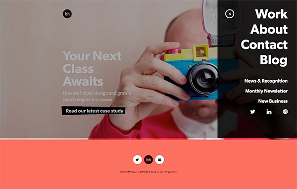
While some designers may tell you that it’s important to be completely transparent and have all content visibly displayed, in 2015, there’s an altogether different trend. Main menus are now being ‘hidden’ and will only appear when the visitor is ready to move on. This creates far more interactive sites – for example, at Brian Hoff Design, there is a hamburger icon on the top right hand site, which hides the main navigation until it is clicked on by the visitor.
While some of 2015’s trends may be cumbersome for designers to take on, it’s an exciting series of new challenges which could develop into something beautiful as the year wears on.

